The Art of Creating a Print
The famous landscape photographer Ansel Adams once said that “the negative is the equivalent of the composer’s score, and the print the performance“. Even being the master printmaker that he was, he would still test out different variations of a print to see what worked . In today’s world of mega pixels and digital imagery this is even more true than at any other time. The tendency is to depend on the technology and what it can do in an instant with the press of a button and we sometimes forget the “art” of printmaking in the automated options that today’s digital tools provide. Creating a great print that inspires the imagination takes trial and error, patience and perseverance.
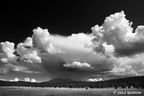
The first thing to consider is the scene being photographed and how it’s exposed in the camera. Is the contrast range of the scene within what your camera can handle? Even though we might be able to “see” details with our own eyes it does not always mean that the camera will be able to translate that into a usable photograph. Some high contrast scenes can fall well outside of what is possible to reproduce unless steps are taken to “adjust” the contrast range. This can be done in a variety of ways in the camera from using polarizes and graduated neutral density filters to HDR (High Dynamic Range) exposures to equalize the density differences that keep the contrast within a range that can be reproduced. Also, “where” you expose an image on the Histogram can make a huge difference. Exposure to the right end of the Histogram, without burning out the highlights, can allow for more shadow detail but requires more image processing in software. How the image is created in the camera should always be considered as the first part of the process.
The next step is how the image actually looks when evaluating it on the computer monitor. It goes without saying that a well calibrated monitor is necessary if you’re to judge your image critically. But, even with a perfectly calibrated display system, some images will look much better on the screen than they will reproduce on a printed surface. This is ultimately due to the dynamic range of the two completely different media. The luminosity of the additive colour space of the RGB light transmitted directly to the eye from a computer screen can get lost when translated to a reflective surface that uses the subtractive CMYK ink process that’s the standard for creating printed images on a sheet of paper.
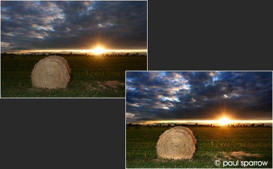
This is where the “art” of processing a file for the printed medium comes into play. Certain parts of an image might need changes to either density and/or colour so they appear on the printed surface like you see them on the monitor. And often this is a trial and error approach where changes have to be made and then printed out to see if they work. Making “test prints” with minor density or colour changes can result in noticeable changes when they get translated to the final printed surface.
Often the tendency is to make these “test prints” at a smaller size so as to save some ink or paper, however, an image’s overall appearance will fundamentally change when seen at different sizes. To save on consumables consider making a “test strip“ through the most important area (as a crop) at the same size as the full print. Getting a real sense of how the image will look at the intended size of the final printed image will help you critically evaluate whether your changes worked.

Print size makes a big difference to how much detail can be seen and is interrelated to the camera original’s resolution. The larger the print size, the more pixels are needed to create a well defined image. This is separate from how sharp the image is when taken, as that can be effected by a variety of things like camera/subject movement, lens sharpness, what aperture it was shot at etc. But, if you’re talking strictly about the file that creates the print, between 200-300 ppi (pixels per inch) is needed at the size of the final print to make sure that detail is translated to the print. Images that don’t have any hard edges or defined detail may look fine towards the lower end of 200 ppi, however images that have very fine intricate detail will require upwards of 300 ppi to look crisp and sharp. So when making larger prints from lower resolution files it’s often necessary to “re-sample” the image up in size to the desired 200-300 ppi to maintain their overall sharpness.
Finally, the type of printer used to produce the image (how many colour inks it uses) can make a huge difference as to how good the final print will look. Since the CMYK ink process is limited in the number of colours it can reproduce, some printers are incapable of reproducing what is there in the file itself. To compensate, some printers have additional primary inks colours like red, green or blue (besides the usual Cyan, Magenta, Yellow, Light Cyan and Light Magenta) and can have multiple “monotone” inks that extend the possible printed colours that can be reproduce.
Even the type of paper can effect the tonal range of the final image. Printing on a glossy surface enhances the tonal range of an image where printing on a matte or canvas textured surface can compromise certain tones.
So even today it still comes down to an “art”. And although we’re now using much more sophisticated tools than Ansel Adams ever did, I think if he had used the same technology as in today’s world of digital photography he probably would have approached his print making the same… one of trial and error, patience and perseverance.
This article originally appeared in Canadian Camera Magazine, the official publication for the Canadian Association of Photographic Art.
© Paul Sparrow 2014